A Five-Minute Film Poster Study with Pencil and Paper
A five-minute film poster study uses simple pencil shapes to reveal how illustration builds mood, scale and tension before the film begins.
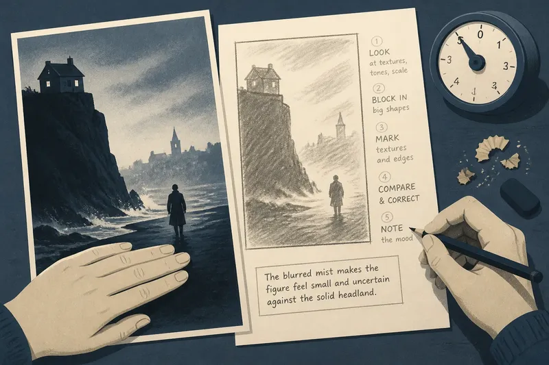
Set a film poster beside a scrap of paper and cover its title with your hand. In a five-minute film poster study, sketch the illustration as a few plain shapes, then see what the arrangement suggests before the lettering supplies its own clues.
This is not a drawing test. A rectangle, a curve and a patch of shading can show how the image uses scale, texture and visual weight to set a tone. Keep the whole poster in view and resist the urge to reproduce its details.
Choose an image with something to simplify
Use a printed poster, a cinema listing or a still image on a screen. Pick one where you can see the entire composition at once and the illustration has recognisable forms, whether it is painted, photographic, collaged or a mixture.
For this exercise, illustration means the imagery arranged to suggest the film, not just hand-drawn pictures. A face, a doorway, a cloud or a small figure against a broad setting can each become a shape worth recording.
Keep the poster at its original size. Looking at it as a whole helps you notice how much the image depends on silhouette and texture rather than tiny details.
Give each minute a clear task
Use a timer if it helps. The sequence below divides the five minutes into distinct tasks, so there is no need to hurry through a step or guess how much time remains.
- Minute one: Look at the poster without drawing. Notice its dominant textures, the largest light and dark areas, and whether the image feels smooth, grainy, hazy or sharply edged.
- Minute two: Draw a loose rectangle for the poster. Add only the biggest illustrated shapes, using circles, blocks, wedges or broad lines.
- Minute three: Mark the quality of the forms. Use a soft smudge for haze, short strokes for rough surfaces or a firm outline for a crisp edge.
- Minute four: Compare your sketch with the poster. Correct one feature that changes its character, such as a misty edge you drew too cleanly or a shadow that should feel heavier.
- Minute five: Write one note about the mood created by the image’s materials and mark-making. Keep it tied to something visible, such as blurred contours or a visibly rough texture.
Use each minute for its named task; a rough result is more useful than a polished miniature that misses the poster’s visual character.
Turn the illustration into broad marks
Draw the largest forms first, then use a few marks to distinguish their surfaces. A dark building might be a block with broken edges; a cloud might be a soft oval shaded lightly at its centre. Leave out faces, costume details and exact wording.
Keep the pencil loose. The sketch records how the imagery is made to feel, not merely where every object sits. If a figure seems lost in a foggy scene, a faint outline can say more than a carefully drawn coat.
Say you are studying an invented poster for a mystery set in a coastal town. The starting image has a dark headland, a small figure and pale mist between them. You block in the headland, draw the figure as a narrow mark and soften the gap with the side of your pencil; the sketch then retains the contrast between a solid landform and an indistinct figure, a visual choice that can make the scene feel uncertain.
Read texture, edges and scale as illustration choices
Compare the sketch with the original. Notice whether the poster’s surfaces look polished or worn, whether its contours are crisp or fading, and whether the figures feel large within their setting or nearly swallowed by it.
These qualities can suggest a mood without fixing its meaning. A rough, broken surface may feel unsettled; a smooth, open expanse may feel calm or strangely bare. Treat those readings as possibilities rather than rules.
Scale also changes the image’s character. An enlarged hand beside a tiny doorway feels unlike a natural-sized figure in a street, while a cropped face can make the poster feel close and immediate. Use your sketch to see which relationships remain after small details disappear.
Try a simple material test: draw one edge twice, once with a clean line and once with a broken, uneven mark. Compare which version better matches the printed or onscreen image.
Notice what colour and lettering add
Return to the full poster after the pencil sketch. Colour can separate shapes that touch, or merge them into one field; a warm patch against cooler surroundings may make a surface appear more prominent, while muted tones can make it recede.
Lettering also occupies visual space. A wide title can cover part of an illustration or echo its hard edges, while a small line of credits may leave the image’s texture largely untouched. Cover and uncover the title to see whether it changes the apparent balance of the forms.
The purpose is not to judge type in isolation. Notice whether the illustration’s surface and mood remain legible without the title, and how the lettering modifies that impression when it returns.
What questions help with a film poster study?
Do I need drawing skill to study a film poster?
No. Use a rectangle, broad shading and a few rough marks to record texture and scale. The sketch only needs to preserve the visual qualities you noticed.
Should I include the title in my sketch?
Leave the title out while drawing the illustration, then note its general area if it covers or interrupts an important form. This keeps the lettering from dictating your first reading of the image.
Can I use a photograph rather than an illustration?
Yes. Study the photograph’s surfaces and edges in the same way, whether they are grainy, crisp, blurred or heavily shadowed. The exercise is about how imagery is presented, not how it was created.
What if the image has several competing textures?
Choose two or three that differ clearly, such as a smooth face against a rough wall. Record each with a separate pencil mark, then note how their contrast affects the poster’s tone.
Keep the observation specific
At the end, write one sentence beside the sketch naming a visible quality and its effect: for example, “The blurred outline makes the figure feel less distinct than the sharp doorway.” That is a firmer reading than guessing the whole plot from one image.
A five-minute film poster study is most useful when it leaves you with a precise observation about how the illustration is handled. Keep the paper if you like; next time, try identifying the image’s surface qualities before you look at the title.