Before the Inkjet: A Short History of Film Poster Printing
Film poster printing moved from hand-prepared artwork to digital files, changing how images, colours and lettering appeared on sheets made for cinema display.
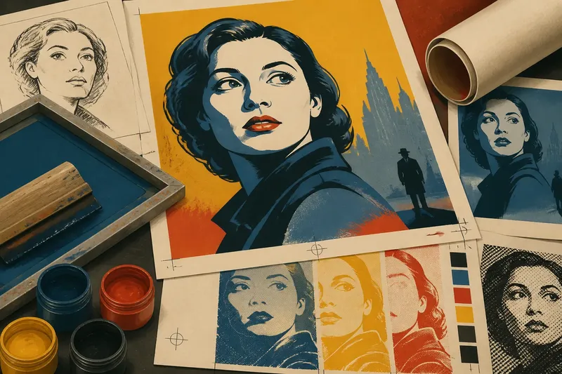
A cinema foyer poster may pair a sharply reproduced face with lettering that looks brushed by hand. Film poster printing has never been one settled technique: the materials and processes behind a design vary across eras, printers and intended uses.
There is no single timetable in which each method replaced the last. Hand-prepared artwork, photographic reproduction, offset lithography, screen printing and digital output have overlapped, and their adoption has differed between places and print jobs. Reading them as a broad sequence helps explain what each made possible without treating a visual clue as proof of a poster’s exact history.
Hand-prepared lithography gave artists room to shape the image
In lithography, an image is prepared on a flat surface and printed through the different behaviour of greasy and water-based areas. For posters, artists could draw or paint bold imagery and lettering, while printers translated that artwork into printable forms. The exact preparation and colour handling depended on the job and workshop.
When colours were printed in separate passes, alignment mattered. A slight shift at an edge can be visible, though it might also come from later wear or damage. Look closely at the joins between colours before deciding what a mark means.
Hand-drawn contours and forceful lettering could preserve an expressive quality in print. The result was not simply a painting reduced to paper: the artist and printer had to account for the limits and possibilities of reproduction.
Photographic reproduction brought film stills into poster design
As photographic reproduction became available for particular poster jobs, designers could use film stills and portraits alongside drawn or painted elements. Adoption was not uniform, and photographic imagery could be combined with other methods rather than replacing them outright.
A photograph also needed preparing for print. Cropping, contrast and the range of tones that a process could reproduce all shaped the result; small details in a source image might not remain clear on the finished sheet.
Say a distributor has a portrait whose expression needs to read in a busy station. The designer crops the image closely and increases the separation between light and dark areas. The expected result is a face that catches the eye quickly, with some subtle tonal detail less visible.
Offset lithography supported coordinated poster campaigns
Offset lithography transfers ink from a plate to a rubber blanket and then to paper. Printers used it for many kinds of commercial work, including poster runs, though the process did not make every campaign identical or erase other printing methods.
For a film campaign, a common design could be adapted for different sheet formats or local information. The paper, ink and artwork preparation still influenced the outcome. A photographic image with gradual tones placed different demands on production from a design built from solid colour areas.
Distribution mattered too. Sheets were packed, shipped and mounted, sometimes folded or trimmed to fit a display. A margin that framed the artwork in the print room might be partly hidden once the poster reached a foyer.
Screen printing made colour layers part of the design
Screen printing pushes ink through open areas of a prepared mesh while blocked sections keep it from reaching the paper. Each colour is applied as a separate layer, making the method suited to direct shapes, solid colour and deliberate overlaps. Designers and printers have used it for different kinds of work, including posters where a tactile surface is wanted.
Because colours are layered, the palette and overlaps shape the image. A small shift between layers can leave a lively edge; the paper may show through in unprinted areas. Such features can suggest how the image was built, but they are not enough on their own to identify a print method.
When you inspect a poster, compare the edges of colour patches with the paper surface. A distinct layer or visible overlap gives you something specific to describe, even if the exact production history remains unknown.
Digital output made short-run changes easier to prepare
Digital printing can send a prepared file towards a printed sheet without the same plate-making sequence used in traditional offset work. It suits some short runs, local versions and replacement copies, while other jobs may still use offset or a different process.
Designers can assemble type, photographs and illustration in a file and adapt the layout for different formats. Print choices still matter: paper, colour handling and output quality affect whether fine lines remain legible or dark areas feel dense.
Imagine a cinema needs to replace a damaged display poster and has an approved digital artwork file. The manager sends it to a local print provider, which produces a replacement without preparing a new offset plate. The new sheet may differ subtly in colour or surface from the earlier copy, so the manager can compare the proofs or samples before choosing the version for display.
Which printing clues can you read from a poster?
Why might colours appear slightly out of alignment?
Separate colour passes can leave one colour a little out of place beside another. Wear, handling or damage can also affect the appearance, so treat registration as a clue rather than a firm identification.
Can a photograph identify the printing method?
No single photograph can establish which method produced a poster, since different processes reproduce photographic imagery. Consider the tonal pattern, surface and edges together, and look for edition or printer details if they are available.
Why can a reprint look different from an earlier copy?
A reprint may use a different printer, file, paper or ink. Those choices can change the way colours and fine details appear even when the underlying design is unchanged.
Does a digital file remove the need to adapt a design?
No. Small lettering, delicate lines and dense colour areas still need to suit the final sheet and output method. A layout that looks clear on screen may need adjustment to remain readable in print.
Check the visible clues before naming a process
- Observe whether colour edges appear offset from one another; if the shifts repeat around separate colour shapes, consider separate colour passes, but if they appear only in a damaged area, treat wear as an alternative explanation.
- Observe whether a photograph has visible tonal dots or a coarse pattern; if the pattern is consistent across the image, consider a printed tonal screen, but if it is absent or unclear, do not identify the process from the photograph alone.
- Observe whether colour forms distinct patches with visible overlaps; if it does, consider a layered printing approach such as screen printing, but if the surface is hard to inspect, describe the visual effect without naming the method.
- Observe whether the sheet has folds, trimmed edges or covered margins; if these are present, account for display and handling when judging the composition, but if the edges are intact, do not assume the poster was never altered.
- Observe whether fine lettering stays crisp across the printed area; if it does, record that as a feature of this copy, but if it looks blurred, consider reproduction, wear or focus before attributing it to a specific process.
- Observe whether a reprint differs in paper or colour from another copy; if it does, note those differences and check any available printer or edition information, but if no comparison copy exists, avoid claims about how the original looked.
Film poster printing is part of reading how a design was prepared, reproduced and displayed. For a useful first description, name what you can see—the edge of a colour layer, a tonal pattern, a fold—then keep the process identification tentative unless supporting information is available.
Next time a poster catches your eye in a foyer, look at the relationship between its image, lettering and paper. Film poster printing can leave visible traces, but careful observation is more reliable than assigning a process from one clue alone.