How Film Poster Composition Directs Your Eye
Learn how film poster composition guides your eye from a striking image to the title and quieter details, even when the brightest shape is not first.
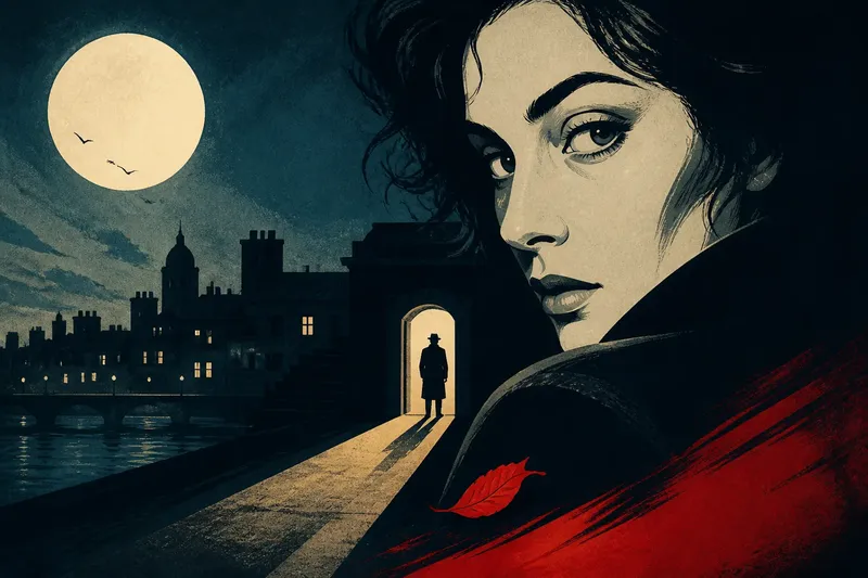
A pale face against a dark doorway can catch your eye before you read a word. Film poster composition shapes that first encounter, then guides attention towards a title, a character or a small clue about the story.
To read the visual hierarchy, notice what claims your attention, what receives it next and what the design leaves for a slower look. The brightest shape may lead, but its neighbours, placement and relationship to other elements can change the route.
Visual hierarchy gives a poster an order
Visual hierarchy is the order in which a design encourages you to notice its elements. One poster might put a character first, a title second and a release line last; another might open with a strange object or an empty stretch of landscape.
Relative size, brightness, colour contrast, sharp edges, placement and empty space all contribute. A large title can dominate by scale, while a much smaller pale face may draw attention first against a nearly black background.
The first thing noticed is not always the film’s main subject. A small red mark in a pale field may catch the eye, then direct it towards a much larger figure nearby.
Contrast and context determine what stands out
Contrast is a noticeable difference between neighbouring parts of an image. Light against dark is one form; saturated colour against a muted field, a sharply defined face against soft scenery, or a solid silhouette against open sky can work just as clearly.
Compare a shape with its immediate surroundings rather than simply looking for the brightest patch. A bright window may blend among other lit windows, while a modest patch of pale skin stands out against a dense, dark background. The setting around a shape matters as much as the shape itself.
Edges also affect the reading order. A crisp outline registers quickly; a hazy glow may take longer to resolve, even if it covers more space. A poster can pair a clear silhouette with soft atmosphere to give the figure a strong presence without making the whole image feel harsh.
Trace the eye from the first focal point to the details
Begin with a quick glance at the whole poster, then look away briefly. On looking again, name the first thing you notice before analysing it. That gives you a concrete starting point.
Next, follow your attention. It may move from a face to the title, then to a small object near the bottom. If it does not move, notice what holds it there: perhaps a direct gaze, an isolated patch of light or several elements competing at equal strength.
Then inspect supporting information. Taglines, billing blocks, production marks and release details usually sit lower in the hierarchy, but their placement still affects the route. Text close to the title may feel connected to it; a compact block at the foot of the poster may wait until you have taken in the main image.
Say you are looking at an invented poster with a white moon above a dark skyline, a small figure in a doorway and a title across the lower half. You notice the moon first, follow the roofline towards the figure and then read the title; the doorway becomes a clue rather than the opening subject. That imagined sequence suggests the design introduces atmosphere before character and film name.
A bright shape can lead without being the main subject
A bright shape may establish a mood, point towards a character or create a question before the viewer recognises what the film is about. First attention and lasting attention are different: one element can attract the eye while another carries the central message.
Look for connections. A beam of light may lead towards a face; a pale patch may echo the title lettering; a coloured object may be the only clue to the plot. If the bright element has no visible link to anything else, it can still create tension, but the route is less explicit.
Notice what the first focal point withholds. A face turned away, a doorway without a visible room or a cropped object can invite a closer look. In such a design, part of the appeal lies in the gap between what catches your attention and what you can understand at once.
Faces, lettering and empty space redirect attention
Faces carry visual weight because expressions and gaze direction are easy to notice. A character looking towards the title can connect it to the image; a gaze aimed beyond the poster may draw attention to an edge and suggest a world outside the frame.
Lettering can interrupt or extend that route. A title over a dark coat may remain legible without becoming the first stop, while lettering in a bright, uncluttered area can become a major focal point. Its shape and colour work as parts of the composition as well as conveying the film’s name.
Empty space is active even when it contains no figure or text. It separates crowded forms and can make a small object feel exposed. A broad, quiet area can also create a pause between the dramatic image and the information below.
Competing focal points can feel deliberate or confusing
Look for several high-contrast elements competing without an evident route between them. A bright face, vivid title and sharply edged object may all demand attention at once. If your gaze jumps between them instead of settling into a sequence, the hierarchy may be intentionally restless or difficult to read.
Consider the intended tone before calling that competition a flaw. A crowded composition can suit a story promising disorder, action or comic excess. The same visual noise may obscure the detail meant to linger in a quieter mystery.
Try describing your scan in a short chain: “face, title, shadowed doorway”. If you cannot name a likely second stop, notice which element keeps pulling you back. That repeated return may be the poster’s centre, even if a different shape first caught your eye.
Thumbnail size changes the composition’s strongest signals
At small size, fine details and small lettering lose clarity, while broad light-dark divisions and large shapes remain visible. A face may become a pale oval, a skyline a dark band and a title a single block. The first point of attention can shift when the poster appears on a phone or in a crowded listing.
Compare the full image with a reduced version on screen. Notice whether the main contrast survives and whether the title still has a clear place in the composition. Details that disappear at small size may still reward a closer look once the poster has made its initial impression.
Read the image at the size where you encountered it as well as at full scale. The thumbnail reveals broad signals; a larger view lets you follow the finer route.
Questions about reading film poster composition?
Is the brightest area always the focal point?
No. Size, colour contrast, edge sharpness and surrounding space also affect what stands out. A bright area among many bright details may draw less attention than a small, isolated shape.
Should the title be the first thing I notice?
Not necessarily. Some posters introduce a face, setting or object before the film name, then use the title to complete the reading. The important question is whether the image gives your attention a clear route towards the lettering.
What does a character’s gaze tell me?
A gaze can connect a face to another element or direct attention beyond the frame. Follow its direction, then check whether an object, title or patch of light gives that route somewhere to land.
Why do I notice different things each time I look?
Once you recognise the main image, details that were easy to miss can come forward. Several strong elements may also compete, shifting your attention as you inspect the poster in a different order.
A short scan makes the visual route easier to describe
Use these checks to identify what attracts attention, what guides it and what rewards a closer look:
- Observe which shape you notice before reading; if it is a face or object, name it as the opening focal point, then look for the next element it connects to.
- Observe the contrast around that shape; if it blends into its surroundings, compare nearby edges or colours instead, and identify the detail that stands apart most clearly.
- Observe where a gaze, line, edge or colour leads; if it points towards the title or another image, follow that route, but if it reaches an empty area, check whether the pause seems deliberate.
- Observe which element appears second, such as a face, title or object; if one is clear, record the sequence, but if several compete, note which one repeatedly draws your attention back.
- Observe whether a small detail changes the main image’s meaning; if it adds a story clue, treat it as a later reveal, but if it does not connect, read it as a separate accent.
- Observe where the tagline, billing block and release details sit; if they follow the main image, read them as supporting information, but if they interrupt the route, consider how that changes the hierarchy.
- Observe what remains legible in a thumbnail; if the title and broad image still read clearly, note that the main signals survive, but if they collapse together, rely on the full-size view for finer details.
The next time you read film poster composition, do more than name the brightest shape. Follow where your eye goes after it, then notice what the design has held back; that quieter detail may be what stays with you after the poster is gone.