The Blue-and-Orange Poster Is Not a Rulebook
Blue and orange film poster colour can signal tension, warmth or distance. Learn to read hue, contrast and light sources to see what a design is selling.
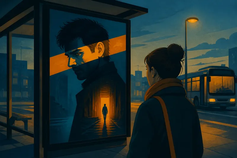
At a bus stop, a dark teal poster catches your eye with a strip of orange light across a face. Blue and orange film poster colour often makes a vivid first impression, but it does not name a genre by itself. The precise hues, their contrast and the objects they colour shape the design’s pitch.
Hue shifts change the palette’s character
“Blue” might mean a pale, greyed sky, clear cyan, deep navy or violet-leaning indigo. Orange can lean towards yellow, like marigold, or towards red, like rust. These shifts change the palette’s temperature: cyan beside red-orange can feel sharp, while muted teal beside ochre may seem softer or older.
When you look at a poster, describe the colours more precisely than “blue” and “orange”. Is the blue smoky or clean? Does the orange glow, brown or verge on pink? Naming what you see makes the interpretation easier to support.
Complementary contrast can make a focal point
Blue and orange sit opposite one another on the colour wheel, so they are complementary hues. Their contrast can make each colour stand out, but it does not automatically signal danger, comedy or spectacle. A sharp orange slash across a blue field feels more confrontational than a small amber lamp in a softly lit blue room.
Lightness matters too. Bright orange against near-black navy can read like a flare, while two mid-toned colours close in brightness may feel more blended. Look at the relationship between the colours, not just their names.
Check the poster at thumbnail size: if the colours run together, their contrast may not be doing as much visual work as you first thought.
Saturation sets the volume
Highly saturated blue and orange can feel theatrical, heightened or synthetic. Muted versions may suggest faded photographs, worn paint or restrained lighting. Neither approach is automatically more serious or realistic; the image around the colours helps establish that impression.
Electric cyan beside vivid orange announces its contrast. Slate blue beside burnt sienna leaves more room for a subdued mood. Notice whether the palette feels freshly lit, weathered or deliberately artificial before reading it as a genre clue.
Light sources and materials give colour a role
Orange might belong to fire, a sunset, a streetlamp, clothing or a flat graphic shape. That distinction changes how it relates to the blue: a lamp can explain the warm light on a face, while a graphic accent may interrupt the image without any visible source.
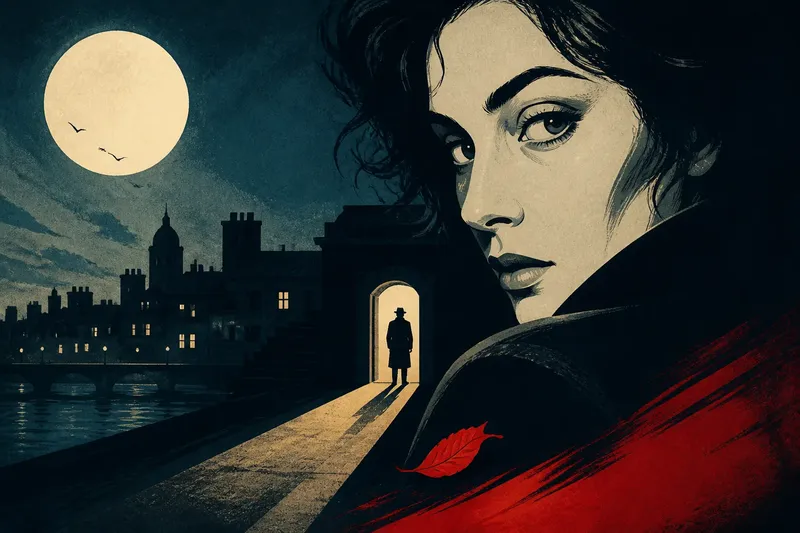
Say you see a poster with a figure in a blue corridor and an orange doorway behind them. If the doorway appears illuminated, it may suggest a way out; if the orange is a flat shape laid over the figure, it may read more like a warning. The visible objects and their placement support either reading, rather than the colour pairing alone.
Ask what the orange illuminates, touches or interrupts. The answer can give you a more useful clue than a fixed colour code.
A third hue can redirect the palette
Green and cyan can pull blue towards turquoise, while violet may make it feel more nocturnal. Yellow can warm orange; red can intensify it or make it feel more intimate. A small third hue in skin, shadows or highlights can alter the relationship between the main colours.
Look at those details separately. Peach light on a face may soften teal shadows; violet shadows with red-orange highlights may make the image feel feverish. Try naming the third colour, even when it occupies little space.
What do readers ask about blue-and-orange posters?
Does blue and orange always mean action?
No. The palette can support different moods, and the subject, lighting and contrast all influence its effect. Look at the figures, setting and movement before treating colour as a genre clue.
Why can the same pairing feel calm or tense?
Soft, muted colours with little contrast may feel calm, while a bright orange mark cutting across dark blue can create tension. The shape and placement of the colour matter as much as the hues themselves.
What should I inspect besides the two main colours?
Check the shadows, skin tones, highlights and background for smaller hues. Notice whether the orange belongs to a lamp, sunset, object or graphic accent.
Can colour alone reveal a film’s genre?
No. Colour can help set an atmosphere, but it cannot identify a genre on its own. Read it alongside the figures, setting, lettering and composition.
Describe what the palette actually does
A useful note might say, “The background is dark teal, and rusty orange light catches the lead’s shoulder.” That describes a visible relationship before proposing what it might mean. It keeps the reading tied to the poster rather than to a universal colour code.
For a blue and orange film poster, identify the hues, compare their lightness and saturation, then trace the warm colour to its source or material. That small habit makes the design’s promise clearer—and leaves room for the film to surprise you.