Tall Letters, Wide Letters: What a Film Poster Title’s Shape Suggests
Film poster title shape affects how lettering sits beside imagery. Learn to read width, spacing and line breaks so each word stays clear and feels intentional.
At a bus stop, you might notice a film poster’s title before you catch the actors’ faces. Film poster title shape—tall and narrow or low and broad—helps set the words apart from the picture, but its effect depends on the letterforms, spacing and print around them.
Rather than treating a typeface as a genre label, look at what its shape does to the title as a word. A condensed face can fit a long name into a narrow space; a broad one can make a short name stretch across the image. Neither choice tells you what the film is like by itself.
Judge the lettering by its silhouette
Squint at the title until the individual letters blur. Notice the outline of the whole word: its height, width, density and any gaps between lines. This silhouette is often more useful than the typeface’s name when you are trying to understand the design.
Condensed letters usually form a taller, narrower word; broad letters occupy more horizontal room. Stroke weight changes the impression too. A wide title drawn with fine strokes may feel airy, while a narrow title in heavy strokes can look dense.
Try covering the image with a scrap of paper and looking only at the lettering. If the words still feel crowded, the issue may be their arrangement rather than the illustration behind them.
Condensed lettering makes long titles easier to place
A condensed typeface can fit a lengthy title where a broad one would run into faces, objects or the edge of the design. It can also echo the vertical direction of a tower, doorway or standing figure without literally describing the story.
Look at the gaps between letters as well as the gaps around the word. Tight spacing can turn separate characters into a dark strip; generous spacing can make a narrow word feel more open. At a small viewing size, either extreme may make letters harder to distinguish.
Pay particular attention to narrow counters: the enclosed spaces inside letters such as O, P and R. If those spaces close up or merge with nearby details, the word may become difficult to read.
Broad lettering gives short titles more horizontal reach
Broad letters can make a short title span a landscape or sit firmly beneath a group of characters. Their width may also draw attention to the side-to-side arrangement of words, particularly when a title is split across lines.
That reach can become a problem if a long word runs into an edge or crosses a detail the viewer needs to recognise. Look for collisions with faces, hands, props and any small supporting text. If the title has to be squeezed into place, its line break or letter width may need reconsidering.
Broad does not automatically mean bold. Compare the strokes with the surrounding shapes: thin lettering over a busy image can lose its outline, while thick letters against a quiet patch can become the dominant feature.
Spacing and line breaks alter the title’s shape
Letter spacing changes the overall width even when the font stays the same. Designers may adjust individual pairs because a diagonal and a vertical stroke can leave an uneven gap, while rounded forms create a different kind of space.
Line breaks matter just as much. A short second line might be centred under a longer one, aligned to its left edge or set off to one side; each arrangement creates a different silhouette. Notice whether the break makes the title easier to scan or separates words that belong together.
Compare the title at its intended viewing size and as a small thumbnail. If the letters merge at the smaller size, note whether tighter spacing, a crowded line break or a lack of contrast is responsible before deciding what should change.
Read the points where letters touch the image
Typography may sit over a flat background, overlap a figure or meet a sharp edge such as a roofline. These contacts affect legibility: letters can blend into a similar-coloured shape, or a gap in a letter can frame a detail and make the word feel part of the scene.
Follow the outer edge of each word where it crosses the picture. If a letter disappears against smoke or a dark coat, the title’s outline is less distinct; if it remains clear, the overlap may look deliberate. This is a question of what is visible, not a fixed meaning attached to a particular font.
Say you have an invented poster showing a person in a doorway, with a long title set in a condensed face. You place the words beside the doorframe, then compare that layout with one crossing the person’s face. In the first version, the frame and lettering form a visible vertical pair while the face stays clear; in the second, the words obscure the person. The first layout would be the clearer choice if the face needs to remain visible.
Which film poster title shape fits the words?
When can condensed lettering suit a long title?
It can accommodate a long phrase in a narrower area than broad lettering. Check that the letters stay distinct at the size at which the poster is meant to be seen.
What can broad lettering do for a short title?
It can carry a short name across more of the design or give it a horizontal base. Check that the expanded word does not collide with the picture or supporting text.
Can a poster use both narrow and broad lettering?
Yes, different words or lines can use contrasting forms. Check that their alignment and spacing make them read as parts of one title rather than separate pieces of lettering.
How can I check a title at thumbnail size?
Reduce the image on screen, or look at it from farther away. If characters merge into an unreadable shape, check the spacing, contrast and line breaks before judging the typeface alone.
Use a side-by-side sketch to compare title shapes
For a quick comparison, keep the image and wording constant and draw two simple title blocks on tracing paper: one tall and narrow, the other broad and low. Mark the faces, objects and supporting copy that must remain visible. The useful result is not a polished design, but a clear choice about which block fits without obscuring those details.
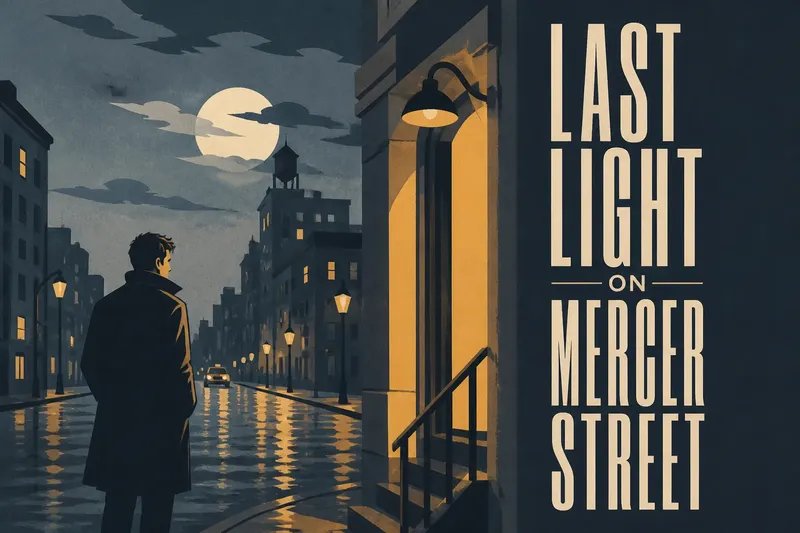
Imagine an invented poster with a wide night-time street, a figure at the left and a doorway at the right. The hypothetical title is “Last Light on Mercer Street”, and its wording stays unchanged in both sketches. First, draw it as a broad block across the bottom; it covers the pavement route towards the figure, so that version loses a visible connection. Next, draw it as a narrow block beside the doorway; the route remains clear, but the smaller letters need checking at thumbnail size. If they stay legible, the narrow layout is the better fit; if they merge, try a shorter line break before choosing the broad version.
Use these checks to make the comparison concrete:
- Title length: If the words crowd the block, then try a line break or narrower lettering; if they fit with clear gaps, keep the arrangement.
- Letter shape: If counters such as the centre of O close up, then choose more open letterforms or increase their size; if they remain distinct, keep the face.
- Spacing: If neighbouring letters blur together, then loosen the spacing; if the word breaks into disconnected characters, bring them closer.
- Image detail: If the title covers a face or essential object, then move it or change its footprint; if the detail remains visible, retain the placement.
- Contrast: If the title edge disappears against the image, then reposition it or change its colour; if the outline stays clear, preserve the treatment.
- Line break: If one line leaves an awkward gap or runs into an edge, then test another break; if the title reads cleanly, keep the current arrangement.
- Supporting text: If names or billing copy collide with the title, then reserve a separate area or adjust the title block; if both remain readable, keep their positions.
When you next see a film poster, compare the title’s outline, spacing and letter-image contacts before deciding what its shape suggests. Film poster title shape is a design choice, not a promise about the film; the letters matter most in relation to the words they form and the picture they share.